
At this year’s VidSummit in Los Angeles Joey Fredrick from Team Edge was presenting his favorite techniques to create great Youtube Thumbnails that stand out and drive traffic to their Youtube Channel ‘Team Edge‘ (https://www.youtube.com/channel/UCaRH3rDr3K3CEfhVqu5mgUQ). He states that these compelling youtube thumbnails he spends up to 2-3 hours to create are one of the reasons Team Edge was able to reach such a big audience.
1. Attention to Detail
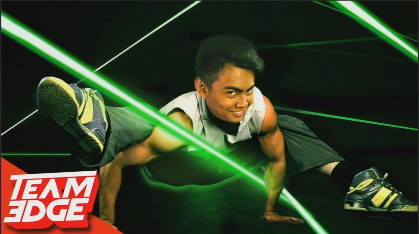
A lot of work should be put into adding details to the thumbnail. In the given example Joey explains, how he created the thumbnail with stock footage from the internet. Not one single picture was created by himself. However this doesn’t mean, you shouldn’t keep an eye on the little details that sell the youtube thumbnails. He did put some work into matching the skin color, adding lasers into the thumbnail including the green light they are casting on the subject. Also the subject is a little overexposed where the lasers are passing close by. The viewer is seeing these details subconsciously without necessarily noticing it.
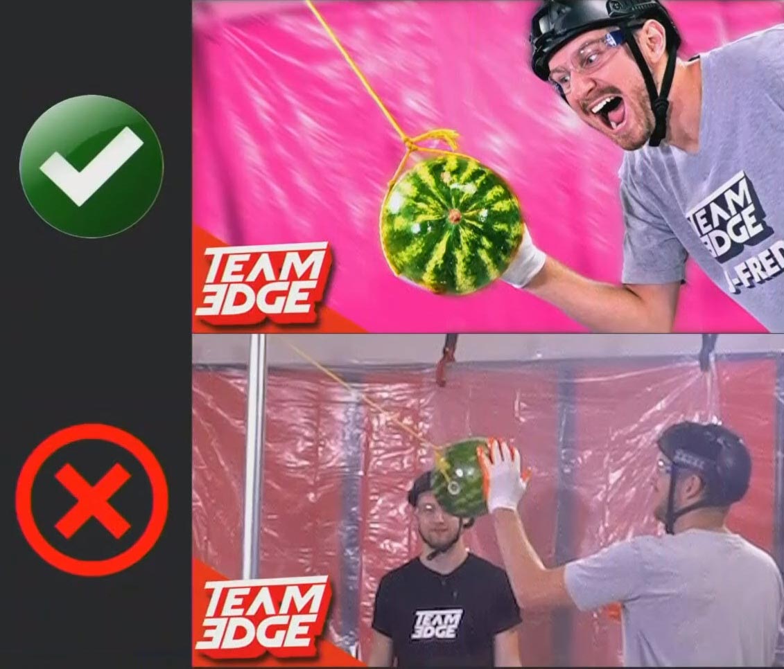
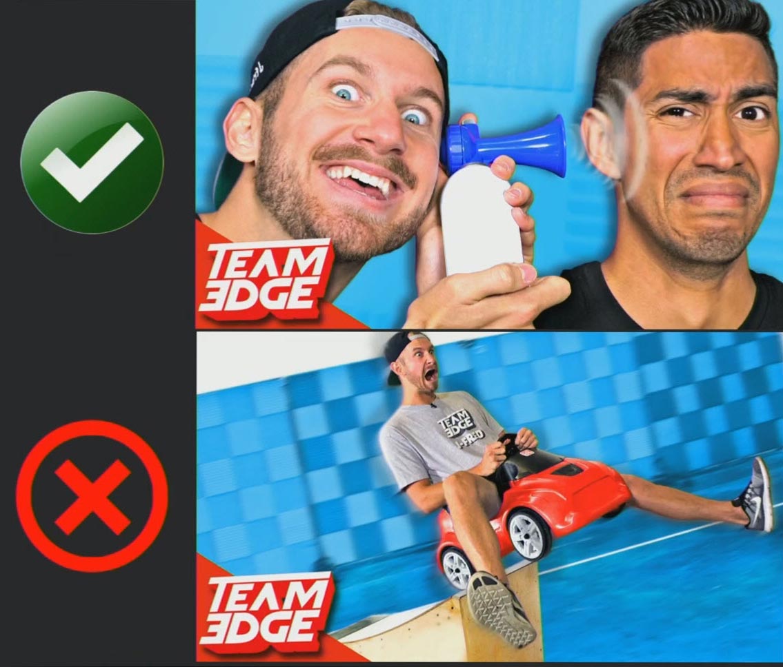
2. Great Photos
This sounds obvious but most people still just use frames from their videos, which im most cases are not ideal, to create good looking youtube thumbnails from. Instead take a dedicated picture, which will look much better than a video frame. You will have more pixel and color information to work with plus you can stage the perfect position and expression for the thumbnail to pop. But keep in mind don’t promise anything that doesn’t show in the video (see No. 7). It should just be a higher quality representation of a scene in the video. Just emulate the original content.
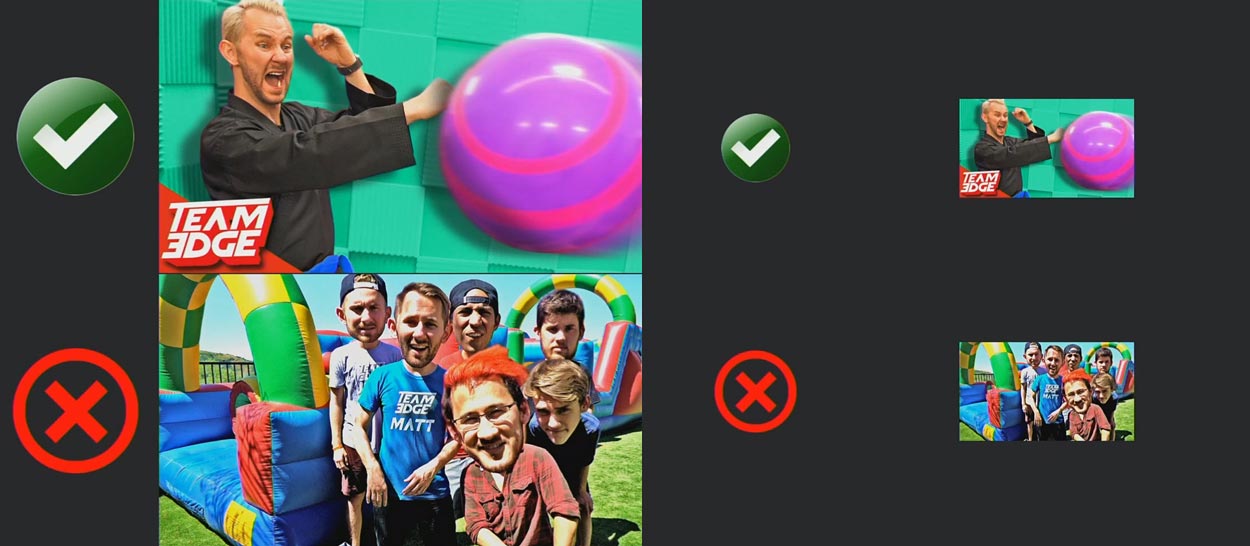
3. Optimize the Screen Real Estate
Take advantage of all the real estate that is available in the thumbnail. Try to cover the entire thumbnail with visual elements. Make sure faces cover as much space as possible so viewers can make eye contact (see No. 6). When the video is listed as a search result or in the video suggestions on a mobile device, these thumbnails are very small. So you definitely want to use every available pixel to your advantage and not leave any empty space unused.
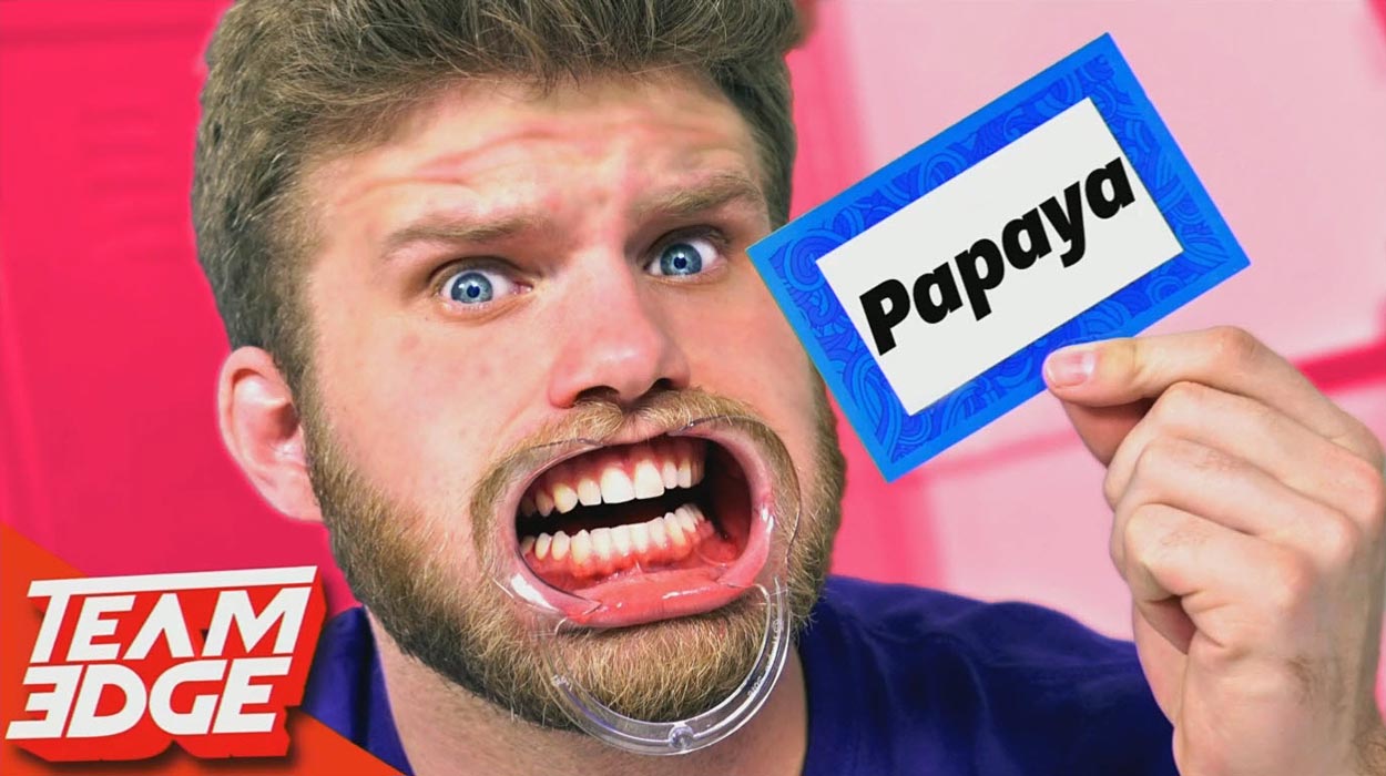
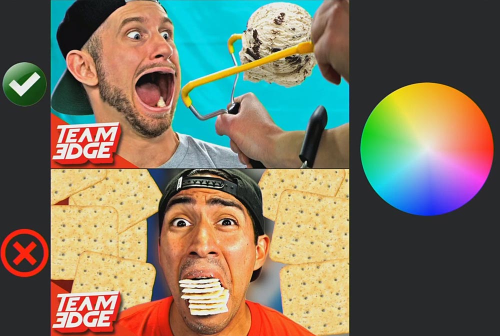
4. Facial Expression – Show Emotions!
The more exaggerated the facial expression on the thumbnail is, the more attention you will draw to it. While you might not show these extreme expressions in the real video, try to overdo it for the thumbnail picture. Think of emotional reactions like laughing, screaming, being surprised or disgusted. Always show expression in the eyes. To put it at it’s simplest: the crazier the face, the more attention it gets!
5. Simplicity!
Keep your thumbnails simple! Many people are trying to stuff as much information into the thumbnail as possible. But this will overload the whole image. Make sure it easy to understand. Also overloading the image will make it harder to indentify the individual elements. Especially when the thumbnails is very small (for instance on a mobile device). That’s why you should always shrink it down every now and then in the process of creating it, to see if it also works when it’s very small. So you can determine if you can still understand what the thumbnail is about and comprehend to the story it is trying to tell.
6. Connect With The Eyes
Viewers always try to connect with the eyes on a picture. Make sure the face covers as much of the thumbnail as possible. Try to enhance the impression of the eyes by brightening them (teeth as well). Here as well, always shrink it down to see if it works with small sizes as well. Most of the time you will end up enlarging the image multiple times because there is always some more room to play with. Faces should always cover as much real estate as possible. Emotion is key!
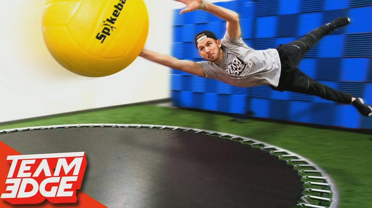
7. Real Looking Photos
Even when you are heavily compositing pictures together at this point. Still try to seek realism in your youtube thumbnails. Of course most thumbnails are obviously composited and exaggerated. But within this design, still try to keep an eye on shadows & light sources. Small details that will help sell the overall design. Try to make it look as if it really happened in the video. Which leads us to the next point.
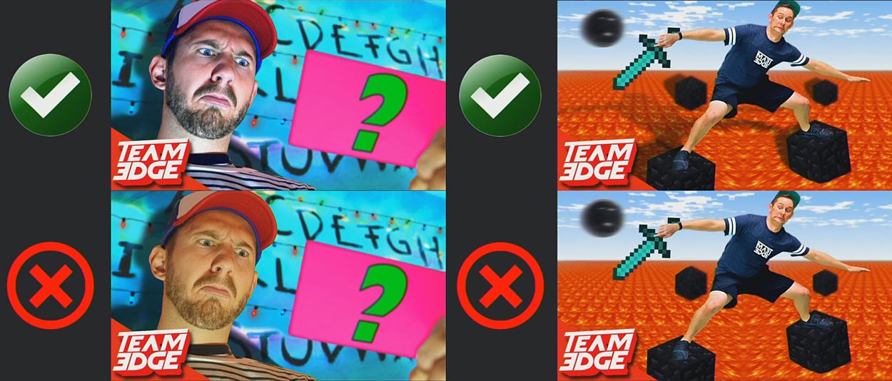
8. Real Edit – Color and Lights / Shadows
When putting different elements together, make sure the colors are balanced. It shouldn’t be too obvious or look unnatural (for instance when the color temperature doesn’t match). This doesn’t mean everything should have the same color. It should just blend together as seamlessly as possible. Same counts for shadows. Even in your weirdest design, try to think about how the shadows would be placed if this was a real scenario. Also try to control the light sources (and thus the attention) by dodging and burning different areas of the picture. All this will also add some depth to the thumbnail which will help for it to stand out in a list of videos.
9. Assault the senses
Try to make the youtube thumbnails as bright as possible without it being overexposed or oversaturated. A lot of people tend to use dark backgrounds to make the subject stand out. But the main goal is to have the thumbnail seen amongst all the other thumbnails, not the subject. The best way to accomplish this is by adding color contrast. Give the background a complementary color like teal or magenta (since mostly humans with warmer skin color are being depicted in the foreground). This way you will get both, a bright image that stands out on a list of videos. And a subject within the thumbnail that is being highlighted by the constrasting background color.
10. Story in relation to the title
Even if there is no subject in the thumbnail, you can still try to tell the story if the video in one picture. Try to communicate a story in relation to the title. Once you get used to this, you’ll be surprised how easy it is to boil down a whole video into 2 or 3 visual elements to communicate the core message. This goes along with No. 5 (simplicity). Always think of the simplest way to visualize what the video is about.
11. No Text!
This is something many youtuber do have opposing opinions about. Joey is suggesting not to show any text on youtube thumbnails. And the data on some channels actually seems to confirm, that thumbnails with text are 40% less likely to be clicked. They argue that it’s just too much to process, the image is too busy. However others utilize this as a chance to trigger curiosity. Either way this is something you should test with your specific content since this is definitely something that works with some content. Whereas other content types, such as informative tutorial videos might benefit from having text on the thumbnail itself.
Joey is actually making one more suggestion and that is branding. This as well is something advanced youtuber tend to have different opinions about. But it’s definitely something that bigger youtubers will have to worry about. Some creators argue that it makes the content look too professional and thus viewers tend to skip the video because they believe there is a professional network behind it. Just like text on the thumbnail this is something you should test out with your content and your branding to see, which way works better for you.